
YITAO LI’S REBELLIOUSNESS BROUGHT HER BACK TO NYFW
TAOTTAO’S FALL/WINTER ‘25 COLLECTION ★ PHOTOGRAPHY BY NI OUYANG ★ LEAD HMU RORY ALVAREZ ★ HMU’S NALANI KRISTY, ANAIYAH AZZURE, SOPHIE HARNETT, CLOUDSKY KHAZRAISHOKATKHOU ★ WORDS BY NEVAEH MODLIN
SPECIAL THANKS TO LINDSEY SOLOMON OF LINDSEY MEDIA

Yitao Li’s newest collection for Taottao’s Fall/Winter 25 follows her continuous theme of nostalgia and non-conformity. Born in Taiyuan, China and moved to the United States at 14, Li’s rebellious stage stemmed from her choice of not following in her family expectations as well as their footsteps of working in finance or economics. In her first collection she was inspired by vintage cartoons, in this newest collection she drew from “antique furniture reimagined through the chaotic motion of a paper shredder”.
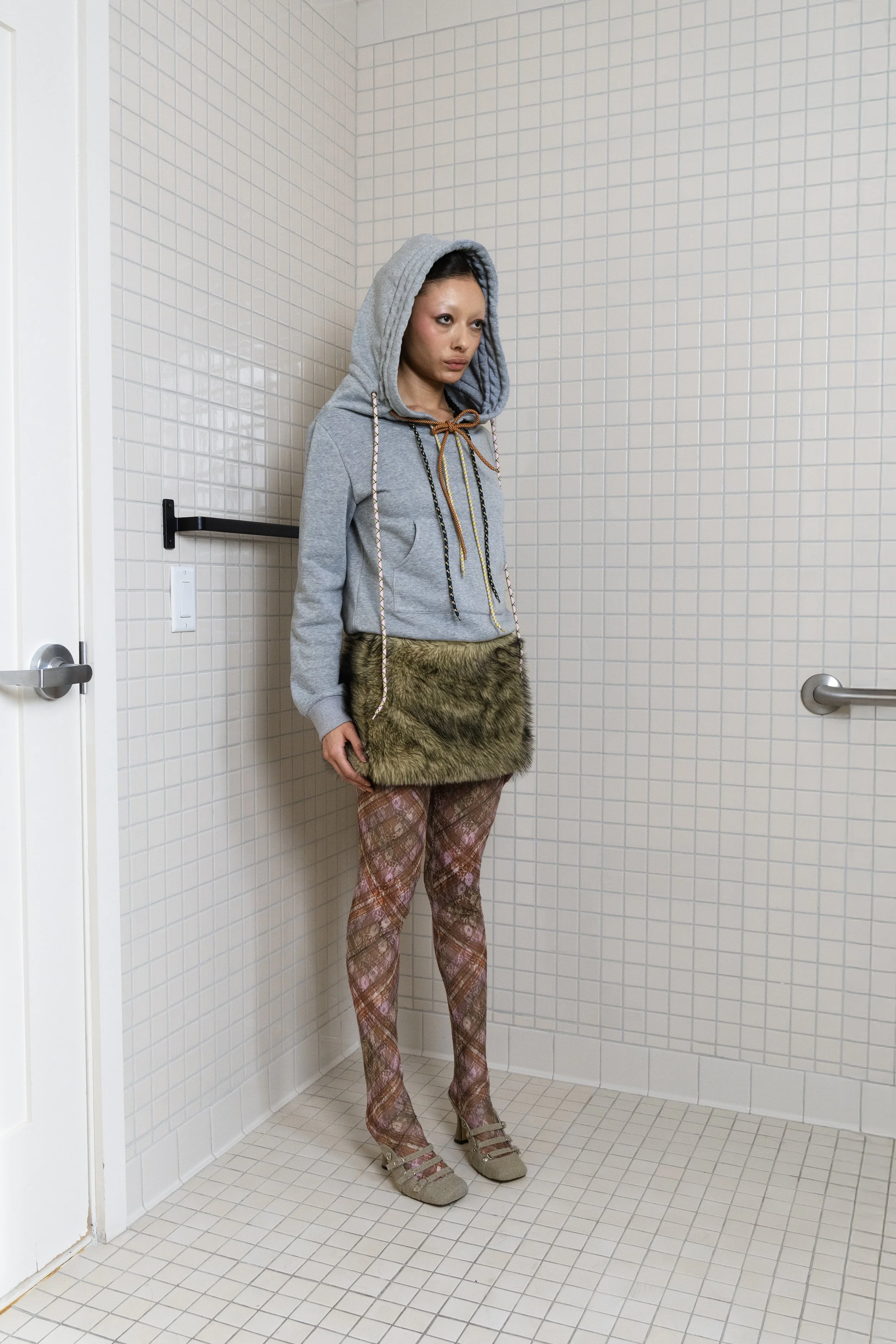
As I viewed the collection, I immediately noticed the pattern mixing of and mixing of fabric textures in many of the looks. Li used plaid, fur, stripes, and denim in earthy tones. Throughout the collection there is a use of multicolored shoe lace string as accessories and in the form of a skirt. The collection has interesting cutouts and pieces that in a way others may not work but Li’s craftsmanship and styling make it all feel like beautiful collages. The use of earthy tones breathes life into Li being inspired by antique furniture because many antiques are in the colors of browns, beiges, blues, nudes, and greens. Antique furniture stems from individuality which is also present in the collection. The collection is a highlight of alternative fashion and being yourself.
The collection also correlates with the sense of comfort and warmth in regards to the fall and winter. Fall and winter brings the end of summer with cold breezes and snow and ice taking over. Li’s collection features puffed coats, sweatshirts, long sleeve shirts, and stockings. On the hoodie of one of her coats it even looks like a rolled up sleeping bag.
With Li’s creative direction for Taottao, the brand’s future seems promising. Her focus on nostalgia with a modern touch and individuality makes the brand something that catches the eye.




/* =========================================================
A WORLDWIDE ARCHIVE — NASTY-INSPIRED EDITORIAL BLOG GRID
Paste into: Design → Custom CSS
========================================================= */
/* ---------- Global archive mood ---------- */
body,
#siteWrapper,
#page,
.page-section,
.collection-type-blog,
.blog-list,
.blog-basic-grid {
background: #000 !important;
color: #fff !important;
}
/* Reduce default Squarespace padding so the archive feels more like a magazine index */
.collection-type-blog #page,
.collection-type-blog .page-section,
.collection-type-blog .content-wrapper,
.collection-type-blog .sqs-layout {
max-width: none !important;
}
.collection-type-blog .content-wrapper {
padding-left: 2vw !important;
padding-right: 2vw !important;
}
/* ---------- Blog grid layout ---------- */
/* Works for most Squarespace 7.1 blog archive/list layouts */
.blog-list,
.blog-basic-grid {
display: grid !important;
grid-template-columns: repeat(3, minmax(0, 1fr)) !important;
column-gap: 18px !important;
row-gap: 70px !important;
align-items: start !important;
width: 100% !important;
}
/* Each blog post card */
.blog-item,
.blog-list-item,
.blog-basic-grid--container {
position: relative !important;
margin: 0 !important;
padding: 0 !important;
background: transparent !important;
border: none !important;
}
/* ---------- Images ---------- */
.blog-item .image-wrapper,
.blog-list-item .image-wrapper,
.blog-basic-grid--container .image-wrapper,
.blog-item .blog-image,
.blog-list-item .blog-image,
.blog-basic-grid--container .blog-image {
overflow: hidden !important;
background: #111 !important;
}
/* Make thumbnails taller and more editorial */
.blog-item img,
.blog-list-item img,
.blog-basic-grid--container img,
.blog-image img,
.image-wrapper img {
width: 100% !important;
height: 52vw !important;
max-height: 620px !important;
min-height: 420px !important;
object-fit: cover !important;
display: block !important;
filter: grayscale(8%) contrast(1.08) brightness(.92) !important;
transition: transform .7s ease, filter .7s ease, opacity .7s ease !important;
}
/* Hover movement */
.blog-item:hover img,
.blog-list-item:hover img,
.blog-basic-grid--container:hover img {
transform: scale(1.035) !important;
filter: grayscale(0%) contrast(1.16) brightness(1) !important;
}
/* ---------- Text block ---------- */
.blog-item .blog-text,
.blog-list-item .blog-text,
.blog-basic-grid--text,
.blog-meta-wrapper,
.blog-meta-section {
color: #fff !important;
}
/* Keep text tight to image */
.blog-item .blog-text,
.blog-list-item .blog-text,
.blog-basic-grid--text {
padding-top: 12px !important;
max-width: 100% !important;
}
/* ---------- Metadata: categories, date, author ---------- */
.blog-meta,
.blog-categories,
.blog-author,
.blog-date,
.blog-meta-wrapper,
.blog-meta-section,
.blog-item .blog-meta a,
.blog-list-item .blog-meta a,
.blog-basic-grid .blog-categories a {
color: rgba(255,255,255,.72) !important;
font-family: Helvetica, Arial, sans-serif !important;
font-size: 10px !important;
line-height: 1.2 !important;
letter-spacing: .08em !important;
text-transform: uppercase !important;
font-weight: 400 !important;
}
/* Category links should feel like editorial labels */
.blog-categories a,
.blog-meta a {
color: rgba(255,255,255,.72) !important;
text-decoration: none !important;
border-bottom: 1px solid rgba(255,255,255,.25) !important;
}
.blog-categories a:hover,
.blog-meta a:hover {
color: #fff !important;
border-bottom-color: #fff !important;
}
/* ---------- Titles ---------- */
.blog-title,
.blog-title a,
.blog-item-title,
.blog-list-item-title,
.blog-basic-grid .blog-title a,
.entry-title,
.entry-title a {
color: #fff !important;
font-family: Helvetica, Arial, sans-serif !important;
font-size: clamp(22px, 2.3vw, 44px) !important;
line-height: .92 !important;
letter-spacing: -.055em !important;
text-transform: none !important;
font-weight: 500 !important;
text-decoration: none !important;
margin-top: 8px !important;
margin-bottom: 8px !important;
}
/* Give titles a sharper hover */
.blog-title a:hover,
.blog-item-title a:hover,
.blog-list-item-title a:hover,
.entry-title a:hover {
opacity: .6 !important;
}
/* ---------- Excerpts ---------- */
.blog-excerpt,
.blog-excerpt p,
.blog-item .excerpt,
.blog-list-item .excerpt {
color: rgba(255,255,255,.76) !important;
font-family: Helvetica, Arial, sans-serif !important;
font-size: clamp(13px, .95vw, 16px) !important;
line-height: 1.28 !important;
letter-spacing: -.015em !important;
margin-top: 8px !important;
margin-bottom: 0 !important;
}
/* Limit excerpts so cards stay clean like an index */
.blog-excerpt {
display: -webkit-box !important;
-webkit-line-clamp: 4 !important;
-webkit-box-orient: vertical !important;
overflow: hidden !important;
}
/* ---------- Read More link ---------- */
.blog-more-link,
.blog-more-link a,
.read-more,
.read-more a,
.blog-item .sqs-block-button-element {
color: #fff !important;
background: transparent !important;
border: none !important;
padding: 0 !important;
margin-top: 14px !important;
font-family: Helvetica, Arial, sans-serif !important;
font-size: 10px !important;
line-height: 1 !important;
letter-spacing: .12em !important;
text-transform: uppercase !important;
text-decoration: none !important;
}
.blog-more-link a::after,
.read-more a::after {
content: " +" !important;
}
.blog-more-link a:hover,
.read-more a:hover {
opacity: .55 !important;
}
/* ---------- Create irregular editorial rhythm ---------- */
/* Every 1st item becomes a larger lead story */
.blog-list > *:nth-child(1),
.blog-basic-grid > *:nth-child(1) {
grid-column: span 2 !important;
}
.blog-list > *:nth-child(1) img,
.blog-basic-grid > *:nth-child(1) img {
height: 64vw !important;
max-height: 780px !important;
}
/* Every 7th item becomes wide, creating a magazine rhythm */
.blog-list > *:nth-child(7n),
.blog-basic-grid > *:nth-child(7n) {
grid-column: span 2 !important;
}
.blog-list > *:nth-child(7n) img,
.blog-basic-grid > *:nth-child(7n) img {
height: 58vw !important;
max-height: 700px !important;
}
/* ---------- Header/navigation harmony ---------- */
.header,
.site-header,
.header-announcement-bar-wrapper {
background: #000 !important;
color: #fff !important;
}
.header a,
.site-header a,
.header-nav a,
.header-menu-nav a {
color: #fff !important;
font-family: Helvetica, Arial, sans-serif !important;
font-size: 11px !important;
letter-spacing: .08em !important;
text-transform: uppercase !important;
}
/* Optional: make the active page feel like a selected magazine tab */
.header-nav-item--active a,
.header-menu-nav-item--active a {
border-bottom: 1px solid #fff !important;
}
/* ---------- Page title / archive title ---------- */
.collection-title,
.blog-list-title,
.page-title,
h1 {
color: #fff !important;
font-family: Helvetica, Arial, sans-serif !important;
font-size: clamp(42px, 8vw, 130px) !important;
line-height: .82 !important;
letter-spacing: -.075em !important;
text-transform: uppercase !important;
font-weight: 500 !important;
margin-bottom: 40px !important;
}
/* ---------- Pagination / load more ---------- */
.blog-list-pagination,
.pagination,
.item-pagination,
.blog-list .pagination {
color: #fff !important;
border-top: 1px solid rgba(255,255,255,.18) !important;
margin-top: 80px !important;
padding-top: 24px !important;
}
.pagination a,
.blog-list-pagination a,
.item-pagination a {
color: #fff !important;
font-family: Helvetica, Arial, sans-serif !important;
font-size: 11px !important;
letter-spacing: .12em !important;
text-transform: uppercase !important;
text-decoration: none !important;
}
/* ---------- Mobile ---------- */
@media screen and (max-width: 1024px) {
.blog-list,
.blog-basic-grid {
grid-template-columns: repeat(2, minmax(0, 1fr)) !important;
column-gap: 14px !important;
row-gap: 52px !important;
}
.blog-list > *:nth-child(1),
.blog-basic-grid > *:nth-child(1),
.blog-list > *:nth-child(7n),
.blog-basic-grid > *:nth-child(7n) {
grid-column: span 2 !important;
}
.blog-item img,
.blog-list-item img,
.blog-basic-grid--container img,
.blog-image img,
.image-wrapper img {
height: 70vw !important;
min-height: 340px !important;
}
}
@media screen and (max-width: 640px) {
.collection-type-blog .content-wrapper {
padding-left: 14px !important;
padding-right: 14px !important;
}
.blog-list,
.blog-basic-grid {
grid-template-columns: 1fr !important;
row-gap: 48px !important;
}
.blog-list > *,
.blog-basic-grid > * {
grid-column: span 1 !important;
}
.blog-item img,
.blog-list-item img,
.blog-basic-grid--container img,
.blog-image img,
.image-wrapper img {
height: 118vw !important;
min-height: 420px !important;
}
.blog-title,
.blog-title a,
.blog-item-title,
.blog-list-item-title,
.entry-title,
.entry-title a {
font-size: 30px !important;
line-height: .9 !important;
}
.blog-excerpt {
-webkit-line-clamp: 3 !important;
}
}