
MELKE’S SUPPER CLUB: HIDDEN VALLEY RANCH GOES HIGH FASHION AT NYFW
MELKE SUPPER CLUB FW25 COLLECTION ★ CREATIVE DIRECTOR EMMA GAGE ★ PHOTOGRAPHED BY CHAD MOON ★ PRODUCTION BACCHUS ★ WARDROBE STYLING BY CARA BENEVENIA ★ HAIR BY AVEDA ★ MAKEUP BY MICHELLE WEBB FOR AUGMENT ★ FOOTWEAR ECCO ★ JEWELRY SEQUIN JEWELRY & MERCER STREET SHOP ★ WORDS BY LACEY COHEN
SPECIAL THANKS TO LINDSEY SOLOMON OF LINDSEY MEDIA

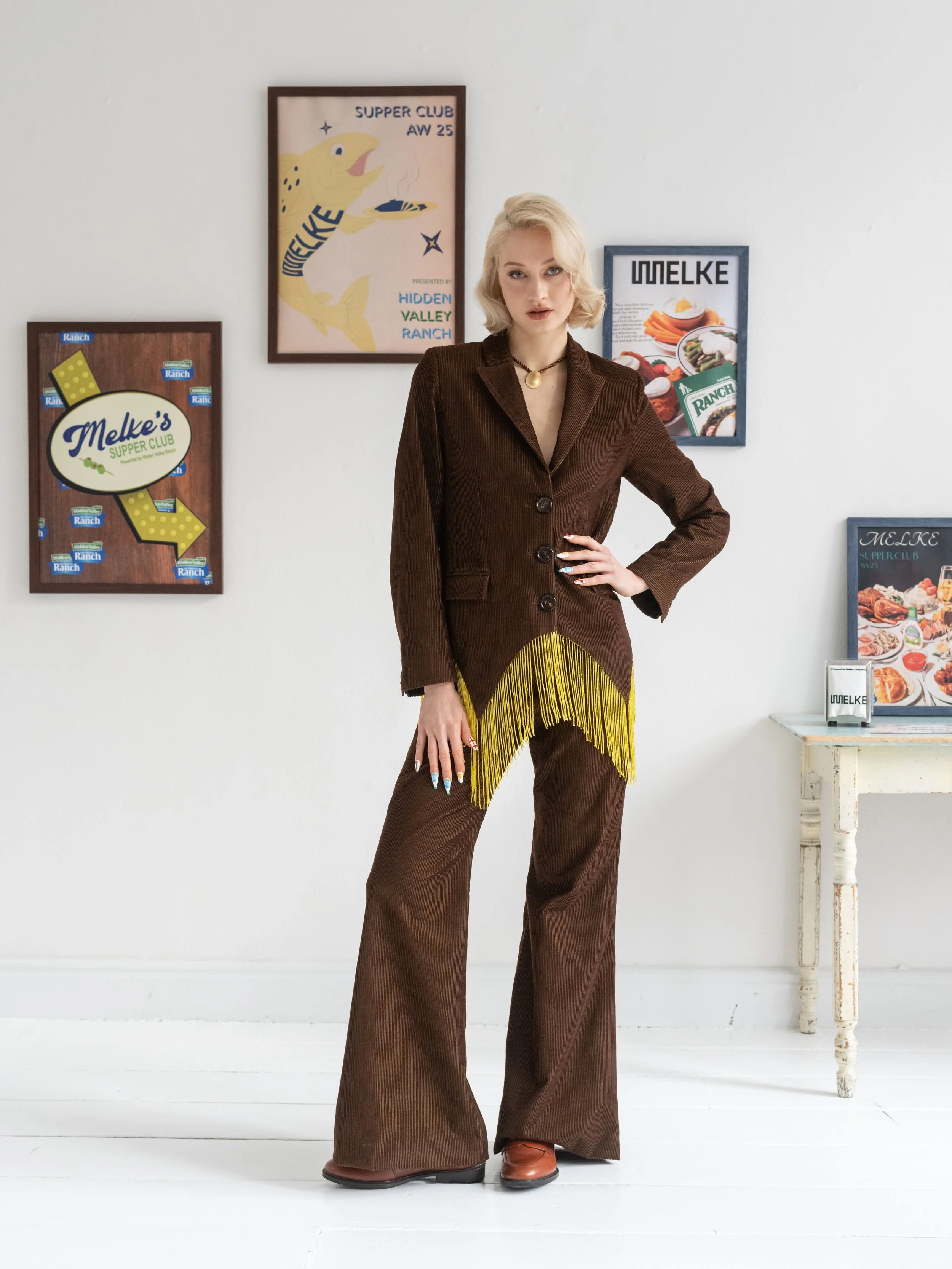
MELKE designer, Emma Gage, pays homage to her Midwestern roots in a big way with the 2025 Supper Club collection. MELKE has partnered with Hidden Valley Ranch to create a collection that features the iconic blue and green Ranch dressing bottle, alongside the comforting accents of a Midwest supper, bringing the welcoming atmosphere of a Midwestern meal to the hardened chic of NYC.
MELKE’s 2025 Supper Club collection exists at the intersection of comfort and food, many pieces featuring some aspect of the Supper Club—Hidden Valley Ranch bottles, appetizers and palette cleansers, extravagant main dishes, and even cutlery. A perfect mix of cool colors and neutral tones, this collection boasts a warmth and comfort that is truly unique, exemplifying Gage’s self-proclaimed ‘Minnesota Nice’ vibe.


/* =========================================================
A WORLDWIDE ARCHIVE — NASTY-INSPIRED EDITORIAL BLOG GRID
Paste into: Design → Custom CSS
========================================================= */
/* ---------- Global archive mood ---------- */
body,
#siteWrapper,
#page,
.page-section,
.collection-type-blog,
.blog-list,
.blog-basic-grid {
background: #000 !important;
color: #fff !important;
}
/* Reduce default Squarespace padding so the archive feels more like a magazine index */
.collection-type-blog #page,
.collection-type-blog .page-section,
.collection-type-blog .content-wrapper,
.collection-type-blog .sqs-layout {
max-width: none !important;
}
.collection-type-blog .content-wrapper {
padding-left: 2vw !important;
padding-right: 2vw !important;
}
/* ---------- Blog grid layout ---------- */
/* Works for most Squarespace 7.1 blog archive/list layouts */
.blog-list,
.blog-basic-grid {
display: grid !important;
grid-template-columns: repeat(3, minmax(0, 1fr)) !important;
column-gap: 18px !important;
row-gap: 70px !important;
align-items: start !important;
width: 100% !important;
}
/* Each blog post card */
.blog-item,
.blog-list-item,
.blog-basic-grid--container {
position: relative !important;
margin: 0 !important;
padding: 0 !important;
background: transparent !important;
border: none !important;
}
/* ---------- Images ---------- */
.blog-item .image-wrapper,
.blog-list-item .image-wrapper,
.blog-basic-grid--container .image-wrapper,
.blog-item .blog-image,
.blog-list-item .blog-image,
.blog-basic-grid--container .blog-image {
overflow: hidden !important;
background: #111 !important;
}
/* Make thumbnails taller and more editorial */
.blog-item img,
.blog-list-item img,
.blog-basic-grid--container img,
.blog-image img,
.image-wrapper img {
width: 100% !important;
height: 52vw !important;
max-height: 620px !important;
min-height: 420px !important;
object-fit: cover !important;
display: block !important;
filter: grayscale(8%) contrast(1.08) brightness(.92) !important;
transition: transform .7s ease, filter .7s ease, opacity .7s ease !important;
}
/* Hover movement */
.blog-item:hover img,
.blog-list-item:hover img,
.blog-basic-grid--container:hover img {
transform: scale(1.035) !important;
filter: grayscale(0%) contrast(1.16) brightness(1) !important;
}
/* ---------- Text block ---------- */
.blog-item .blog-text,
.blog-list-item .blog-text,
.blog-basic-grid--text,
.blog-meta-wrapper,
.blog-meta-section {
color: #fff !important;
}
/* Keep text tight to image */
.blog-item .blog-text,
.blog-list-item .blog-text,
.blog-basic-grid--text {
padding-top: 12px !important;
max-width: 100% !important;
}
/* ---------- Metadata: categories, date, author ---------- */
.blog-meta,
.blog-categories,
.blog-author,
.blog-date,
.blog-meta-wrapper,
.blog-meta-section,
.blog-item .blog-meta a,
.blog-list-item .blog-meta a,
.blog-basic-grid .blog-categories a {
color: rgba(255,255,255,.72) !important;
font-family: Helvetica, Arial, sans-serif !important;
font-size: 10px !important;
line-height: 1.2 !important;
letter-spacing: .08em !important;
text-transform: uppercase !important;
font-weight: 400 !important;
}
/* Category links should feel like editorial labels */
.blog-categories a,
.blog-meta a {
color: rgba(255,255,255,.72) !important;
text-decoration: none !important;
border-bottom: 1px solid rgba(255,255,255,.25) !important;
}
.blog-categories a:hover,
.blog-meta a:hover {
color: #fff !important;
border-bottom-color: #fff !important;
}
/* ---------- Titles ---------- */
.blog-title,
.blog-title a,
.blog-item-title,
.blog-list-item-title,
.blog-basic-grid .blog-title a,
.entry-title,
.entry-title a {
color: #fff !important;
font-family: Helvetica, Arial, sans-serif !important;
font-size: clamp(22px, 2.3vw, 44px) !important;
line-height: .92 !important;
letter-spacing: -.055em !important;
text-transform: none !important;
font-weight: 500 !important;
text-decoration: none !important;
margin-top: 8px !important;
margin-bottom: 8px !important;
}
/* Give titles a sharper hover */
.blog-title a:hover,
.blog-item-title a:hover,
.blog-list-item-title a:hover,
.entry-title a:hover {
opacity: .6 !important;
}
/* ---------- Excerpts ---------- */
.blog-excerpt,
.blog-excerpt p,
.blog-item .excerpt,
.blog-list-item .excerpt {
color: rgba(255,255,255,.76) !important;
font-family: Helvetica, Arial, sans-serif !important;
font-size: clamp(13px, .95vw, 16px) !important;
line-height: 1.28 !important;
letter-spacing: -.015em !important;
margin-top: 8px !important;
margin-bottom: 0 !important;
}
/* Limit excerpts so cards stay clean like an index */
.blog-excerpt {
display: -webkit-box !important;
-webkit-line-clamp: 4 !important;
-webkit-box-orient: vertical !important;
overflow: hidden !important;
}
/* ---------- Read More link ---------- */
.blog-more-link,
.blog-more-link a,
.read-more,
.read-more a,
.blog-item .sqs-block-button-element {
color: #fff !important;
background: transparent !important;
border: none !important;
padding: 0 !important;
margin-top: 14px !important;
font-family: Helvetica, Arial, sans-serif !important;
font-size: 10px !important;
line-height: 1 !important;
letter-spacing: .12em !important;
text-transform: uppercase !important;
text-decoration: none !important;
}
.blog-more-link a::after,
.read-more a::after {
content: " +" !important;
}
.blog-more-link a:hover,
.read-more a:hover {
opacity: .55 !important;
}
/* ---------- Create irregular editorial rhythm ---------- */
/* Every 1st item becomes a larger lead story */
.blog-list > *:nth-child(1),
.blog-basic-grid > *:nth-child(1) {
grid-column: span 2 !important;
}
.blog-list > *:nth-child(1) img,
.blog-basic-grid > *:nth-child(1) img {
height: 64vw !important;
max-height: 780px !important;
}
/* Every 7th item becomes wide, creating a magazine rhythm */
.blog-list > *:nth-child(7n),
.blog-basic-grid > *:nth-child(7n) {
grid-column: span 2 !important;
}
.blog-list > *:nth-child(7n) img,
.blog-basic-grid > *:nth-child(7n) img {
height: 58vw !important;
max-height: 700px !important;
}
/* ---------- Header/navigation harmony ---------- */
.header,
.site-header,
.header-announcement-bar-wrapper {
background: #000 !important;
color: #fff !important;
}
.header a,
.site-header a,
.header-nav a,
.header-menu-nav a {
color: #fff !important;
font-family: Helvetica, Arial, sans-serif !important;
font-size: 11px !important;
letter-spacing: .08em !important;
text-transform: uppercase !important;
}
/* Optional: make the active page feel like a selected magazine tab */
.header-nav-item--active a,
.header-menu-nav-item--active a {
border-bottom: 1px solid #fff !important;
}
/* ---------- Page title / archive title ---------- */
.collection-title,
.blog-list-title,
.page-title,
h1 {
color: #fff !important;
font-family: Helvetica, Arial, sans-serif !important;
font-size: clamp(42px, 8vw, 130px) !important;
line-height: .82 !important;
letter-spacing: -.075em !important;
text-transform: uppercase !important;
font-weight: 500 !important;
margin-bottom: 40px !important;
}
/* ---------- Pagination / load more ---------- */
.blog-list-pagination,
.pagination,
.item-pagination,
.blog-list .pagination {
color: #fff !important;
border-top: 1px solid rgba(255,255,255,.18) !important;
margin-top: 80px !important;
padding-top: 24px !important;
}
.pagination a,
.blog-list-pagination a,
.item-pagination a {
color: #fff !important;
font-family: Helvetica, Arial, sans-serif !important;
font-size: 11px !important;
letter-spacing: .12em !important;
text-transform: uppercase !important;
text-decoration: none !important;
}
/* ---------- Mobile ---------- */
@media screen and (max-width: 1024px) {
.blog-list,
.blog-basic-grid {
grid-template-columns: repeat(2, minmax(0, 1fr)) !important;
column-gap: 14px !important;
row-gap: 52px !important;
}
.blog-list > *:nth-child(1),
.blog-basic-grid > *:nth-child(1),
.blog-list > *:nth-child(7n),
.blog-basic-grid > *:nth-child(7n) {
grid-column: span 2 !important;
}
.blog-item img,
.blog-list-item img,
.blog-basic-grid--container img,
.blog-image img,
.image-wrapper img {
height: 70vw !important;
min-height: 340px !important;
}
}
@media screen and (max-width: 640px) {
.collection-type-blog .content-wrapper {
padding-left: 14px !important;
padding-right: 14px !important;
}
.blog-list,
.blog-basic-grid {
grid-template-columns: 1fr !important;
row-gap: 48px !important;
}
.blog-list > *,
.blog-basic-grid > * {
grid-column: span 1 !important;
}
.blog-item img,
.blog-list-item img,
.blog-basic-grid--container img,
.blog-image img,
.image-wrapper img {
height: 118vw !important;
min-height: 420px !important;
}
.blog-title,
.blog-title a,
.blog-item-title,
.blog-list-item-title,
.entry-title,
.entry-title a {
font-size: 30px !important;
line-height: .9 !important;
}
.blog-excerpt {
-webkit-line-clamp: 3 !important;
}
}