
HUSS’S 25TH: WHERE SELF-LOVE MEETS COMMUNITY JOY
FEATURING HUSS, JAZZY MMEREOLE, SEERAT SAINI, + HAWA WHO ★ PHOTOS & CREATIVE DIRECTION BY B DOMINGUEZ + SEERAT SAINI ★ LEAD STYLING BY B DOMINGUEZ ★ WORDS BY ANDYOMO
Huss’s 25th birthday wasn’t just a celebration—it was a journey.
Over two unforgettable weeks, Huss brought his closest friends and family along for a whirlwind of joy, indulgence, and memories that spanned cities, cuisines, and good energy only—truly one for the books!!
It kicked off with a nostalgic food tour in Austin, Texas, revisiting his favorite college eats, followed by horseback riding over in Houston with family and friends (because, obviously, galloping into 25 is the way to go). Its giving movie moment! Yet half way across the country, Huss continued to take things to the next level!
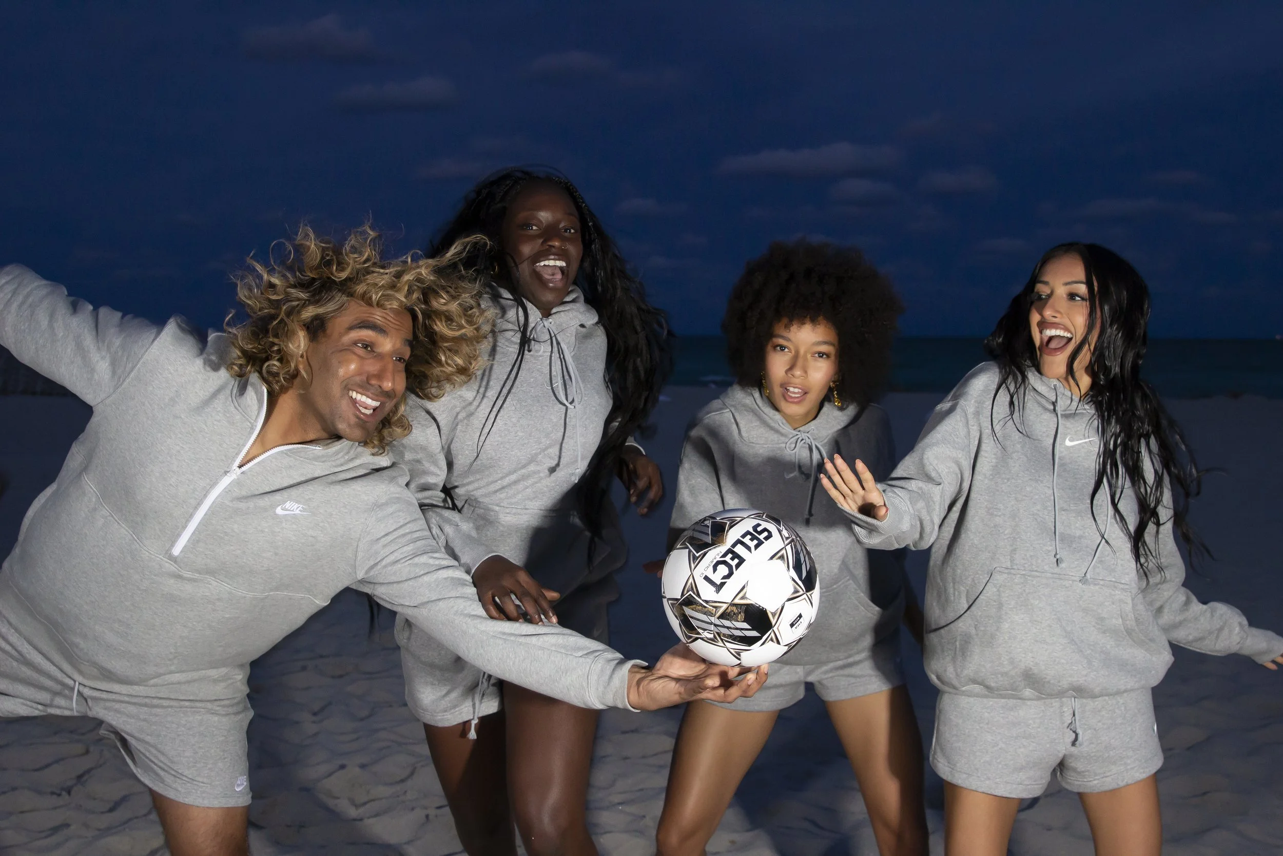
Next stop? Miami! South Beach, to be exact—where Huss and his crew turned the sand into their personal soccer stadium, living out his very own Cristiano Ronaldo fantasies. The vibes? Immaculate. The sunscreen? Mandatory. As the sun dipped, Huss brought everyone together for an intimate Italian feast that was equal parts decadent and heartfelt. We’re talking Burrata salad, Margherita pizza, Raggaoti, and to top it all off, an olive oil birthday cake paired with Tiramisu. It was true indulgence done right. The feverdream of a night ended with fireworks lighting up Miami’s sky at 26th Street Beach—a dazzling moment to toast not just the new year but to this brand new chapter in Huss’s life.
Just when it seemed the celebrations had reached their peak in Miami, Huss and his community took the party to Puerto Rico for an unforgettable finale. Over five sun-drenched days, they embraced the warmth of the Caribbean, turning every moment into a celebration of love, laughter, and togetherness. From lush landscapes to vibrant memories, the extended revelry carried the spirit of Huss’s milestone birthday all the way to January 7th, closing out the extravaganza with the kind of joy and connection that only he could inspire.
At WORLDWIDE, we believe in celebrating the storytellers, the creatives, and the moments that bring us closer together. Huss’s milestone reminds us why we champion voices like his—because they remind us to live boldly, uplift our communities, and never stop dreaming. Cheers to Huss, to 25, and to the stories that connect us all!




/* =========================================================
A WORLDWIDE ARCHIVE — NASTY-INSPIRED EDITORIAL BLOG GRID
Paste into: Design → Custom CSS
========================================================= */
/* ---------- Global archive mood ---------- */
body,
#siteWrapper,
#page,
.page-section,
.collection-type-blog,
.blog-list,
.blog-basic-grid {
background: #000 !important;
color: #fff !important;
}
/* Reduce default Squarespace padding so the archive feels more like a magazine index */
.collection-type-blog #page,
.collection-type-blog .page-section,
.collection-type-blog .content-wrapper,
.collection-type-blog .sqs-layout {
max-width: none !important;
}
.collection-type-blog .content-wrapper {
padding-left: 2vw !important;
padding-right: 2vw !important;
}
/* ---------- Blog grid layout ---------- */
/* Works for most Squarespace 7.1 blog archive/list layouts */
.blog-list,
.blog-basic-grid {
display: grid !important;
grid-template-columns: repeat(3, minmax(0, 1fr)) !important;
column-gap: 18px !important;
row-gap: 70px !important;
align-items: start !important;
width: 100% !important;
}
/* Each blog post card */
.blog-item,
.blog-list-item,
.blog-basic-grid--container {
position: relative !important;
margin: 0 !important;
padding: 0 !important;
background: transparent !important;
border: none !important;
}
/* ---------- Images ---------- */
.blog-item .image-wrapper,
.blog-list-item .image-wrapper,
.blog-basic-grid--container .image-wrapper,
.blog-item .blog-image,
.blog-list-item .blog-image,
.blog-basic-grid--container .blog-image {
overflow: hidden !important;
background: #111 !important;
}
/* Make thumbnails taller and more editorial */
.blog-item img,
.blog-list-item img,
.blog-basic-grid--container img,
.blog-image img,
.image-wrapper img {
width: 100% !important;
height: 52vw !important;
max-height: 620px !important;
min-height: 420px !important;
object-fit: cover !important;
display: block !important;
filter: grayscale(8%) contrast(1.08) brightness(.92) !important;
transition: transform .7s ease, filter .7s ease, opacity .7s ease !important;
}
/* Hover movement */
.blog-item:hover img,
.blog-list-item:hover img,
.blog-basic-grid--container:hover img {
transform: scale(1.035) !important;
filter: grayscale(0%) contrast(1.16) brightness(1) !important;
}
/* ---------- Text block ---------- */
.blog-item .blog-text,
.blog-list-item .blog-text,
.blog-basic-grid--text,
.blog-meta-wrapper,
.blog-meta-section {
color: #fff !important;
}
/* Keep text tight to image */
.blog-item .blog-text,
.blog-list-item .blog-text,
.blog-basic-grid--text {
padding-top: 12px !important;
max-width: 100% !important;
}
/* ---------- Metadata: categories, date, author ---------- */
.blog-meta,
.blog-categories,
.blog-author,
.blog-date,
.blog-meta-wrapper,
.blog-meta-section,
.blog-item .blog-meta a,
.blog-list-item .blog-meta a,
.blog-basic-grid .blog-categories a {
color: rgba(255,255,255,.72) !important;
font-family: Helvetica, Arial, sans-serif !important;
font-size: 10px !important;
line-height: 1.2 !important;
letter-spacing: .08em !important;
text-transform: uppercase !important;
font-weight: 400 !important;
}
/* Category links should feel like editorial labels */
.blog-categories a,
.blog-meta a {
color: rgba(255,255,255,.72) !important;
text-decoration: none !important;
border-bottom: 1px solid rgba(255,255,255,.25) !important;
}
.blog-categories a:hover,
.blog-meta a:hover {
color: #fff !important;
border-bottom-color: #fff !important;
}
/* ---------- Titles ---------- */
.blog-title,
.blog-title a,
.blog-item-title,
.blog-list-item-title,
.blog-basic-grid .blog-title a,
.entry-title,
.entry-title a {
color: #fff !important;
font-family: Helvetica, Arial, sans-serif !important;
font-size: clamp(22px, 2.3vw, 44px) !important;
line-height: .92 !important;
letter-spacing: -.055em !important;
text-transform: none !important;
font-weight: 500 !important;
text-decoration: none !important;
margin-top: 8px !important;
margin-bottom: 8px !important;
}
/* Give titles a sharper hover */
.blog-title a:hover,
.blog-item-title a:hover,
.blog-list-item-title a:hover,
.entry-title a:hover {
opacity: .6 !important;
}
/* ---------- Excerpts ---------- */
.blog-excerpt,
.blog-excerpt p,
.blog-item .excerpt,
.blog-list-item .excerpt {
color: rgba(255,255,255,.76) !important;
font-family: Helvetica, Arial, sans-serif !important;
font-size: clamp(13px, .95vw, 16px) !important;
line-height: 1.28 !important;
letter-spacing: -.015em !important;
margin-top: 8px !important;
margin-bottom: 0 !important;
}
/* Limit excerpts so cards stay clean like an index */
.blog-excerpt {
display: -webkit-box !important;
-webkit-line-clamp: 4 !important;
-webkit-box-orient: vertical !important;
overflow: hidden !important;
}
/* ---------- Read More link ---------- */
.blog-more-link,
.blog-more-link a,
.read-more,
.read-more a,
.blog-item .sqs-block-button-element {
color: #fff !important;
background: transparent !important;
border: none !important;
padding: 0 !important;
margin-top: 14px !important;
font-family: Helvetica, Arial, sans-serif !important;
font-size: 10px !important;
line-height: 1 !important;
letter-spacing: .12em !important;
text-transform: uppercase !important;
text-decoration: none !important;
}
.blog-more-link a::after,
.read-more a::after {
content: " +" !important;
}
.blog-more-link a:hover,
.read-more a:hover {
opacity: .55 !important;
}
/* ---------- Create irregular editorial rhythm ---------- */
/* Every 1st item becomes a larger lead story */
.blog-list > *:nth-child(1),
.blog-basic-grid > *:nth-child(1) {
grid-column: span 2 !important;
}
.blog-list > *:nth-child(1) img,
.blog-basic-grid > *:nth-child(1) img {
height: 64vw !important;
max-height: 780px !important;
}
/* Every 7th item becomes wide, creating a magazine rhythm */
.blog-list > *:nth-child(7n),
.blog-basic-grid > *:nth-child(7n) {
grid-column: span 2 !important;
}
.blog-list > *:nth-child(7n) img,
.blog-basic-grid > *:nth-child(7n) img {
height: 58vw !important;
max-height: 700px !important;
}
/* ---------- Header/navigation harmony ---------- */
.header,
.site-header,
.header-announcement-bar-wrapper {
background: #000 !important;
color: #fff !important;
}
.header a,
.site-header a,
.header-nav a,
.header-menu-nav a {
color: #fff !important;
font-family: Helvetica, Arial, sans-serif !important;
font-size: 11px !important;
letter-spacing: .08em !important;
text-transform: uppercase !important;
}
/* Optional: make the active page feel like a selected magazine tab */
.header-nav-item--active a,
.header-menu-nav-item--active a {
border-bottom: 1px solid #fff !important;
}
/* ---------- Page title / archive title ---------- */
.collection-title,
.blog-list-title,
.page-title,
h1 {
color: #fff !important;
font-family: Helvetica, Arial, sans-serif !important;
font-size: clamp(42px, 8vw, 130px) !important;
line-height: .82 !important;
letter-spacing: -.075em !important;
text-transform: uppercase !important;
font-weight: 500 !important;
margin-bottom: 40px !important;
}
/* ---------- Pagination / load more ---------- */
.blog-list-pagination,
.pagination,
.item-pagination,
.blog-list .pagination {
color: #fff !important;
border-top: 1px solid rgba(255,255,255,.18) !important;
margin-top: 80px !important;
padding-top: 24px !important;
}
.pagination a,
.blog-list-pagination a,
.item-pagination a {
color: #fff !important;
font-family: Helvetica, Arial, sans-serif !important;
font-size: 11px !important;
letter-spacing: .12em !important;
text-transform: uppercase !important;
text-decoration: none !important;
}
/* ---------- Mobile ---------- */
@media screen and (max-width: 1024px) {
.blog-list,
.blog-basic-grid {
grid-template-columns: repeat(2, minmax(0, 1fr)) !important;
column-gap: 14px !important;
row-gap: 52px !important;
}
.blog-list > *:nth-child(1),
.blog-basic-grid > *:nth-child(1),
.blog-list > *:nth-child(7n),
.blog-basic-grid > *:nth-child(7n) {
grid-column: span 2 !important;
}
.blog-item img,
.blog-list-item img,
.blog-basic-grid--container img,
.blog-image img,
.image-wrapper img {
height: 70vw !important;
min-height: 340px !important;
}
}
@media screen and (max-width: 640px) {
.collection-type-blog .content-wrapper {
padding-left: 14px !important;
padding-right: 14px !important;
}
.blog-list,
.blog-basic-grid {
grid-template-columns: 1fr !important;
row-gap: 48px !important;
}
.blog-list > *,
.blog-basic-grid > * {
grid-column: span 1 !important;
}
.blog-item img,
.blog-list-item img,
.blog-basic-grid--container img,
.blog-image img,
.image-wrapper img {
height: 118vw !important;
min-height: 420px !important;
}
.blog-title,
.blog-title a,
.blog-item-title,
.blog-list-item-title,
.entry-title,
.entry-title a {
font-size: 30px !important;
line-height: .9 !important;
}
.blog-excerpt {
-webkit-line-clamp: 3 !important;
}
}