
AISTE HONG BRINGS EUROPEAN ELEGANCE TO NYFW
AISTE HONG FW25 COLLECTION, “WHITE NIGHTS” ★ DESIGNER AISTE HONG ★ PHOTOGRAPHY BY TOM CONDORDIA WITH GETTY IMAGES ★ BEAUTY SPONSORED BY DRHAZI ★ JEWELRY PROVIDED BY MING YUNG WANG NEW YORK ★ WORDS BY NEVAEH MODLIN
SPECIAL THANKS TO LINDSEY SOLOMON OF LINDSEY MEDIA

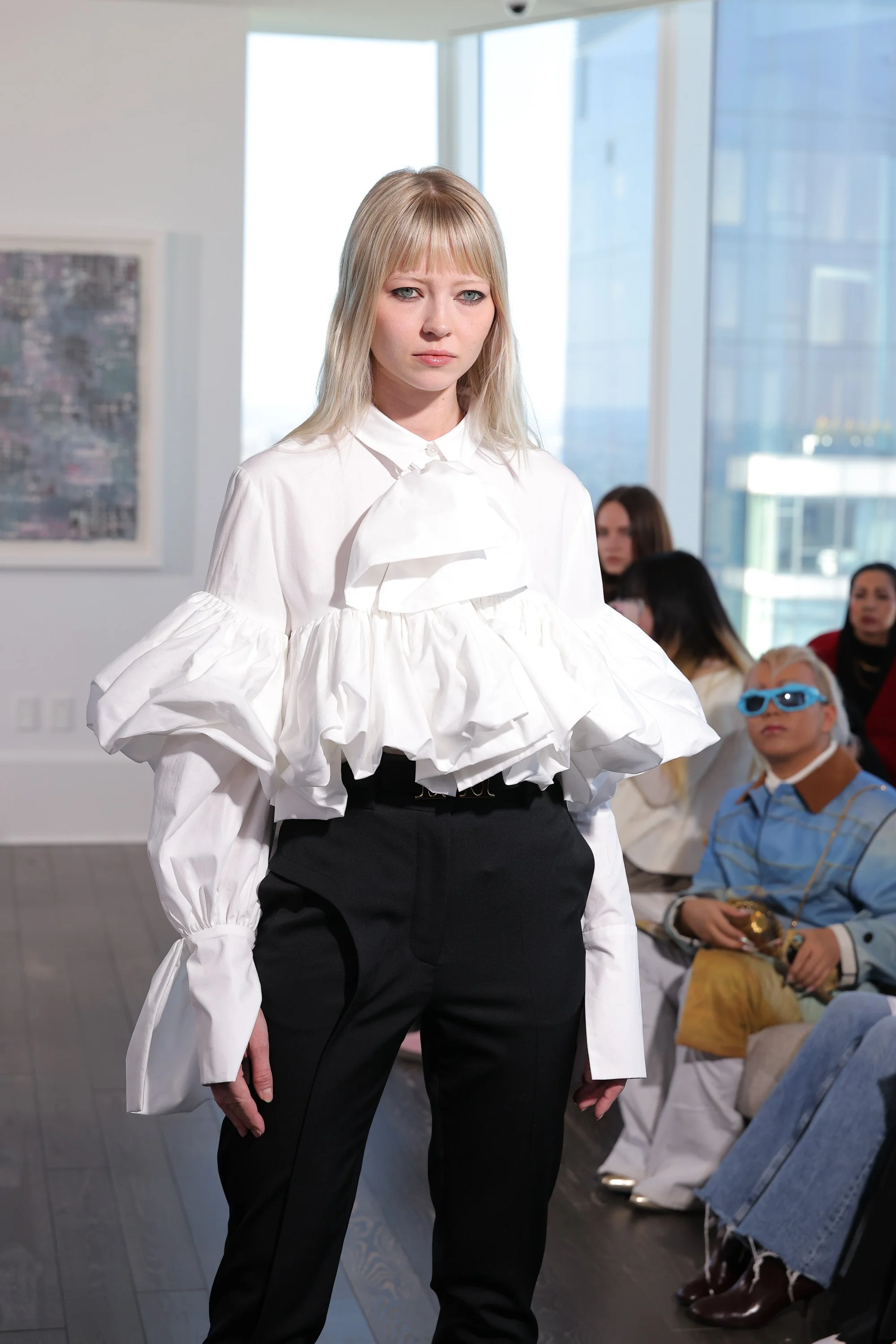
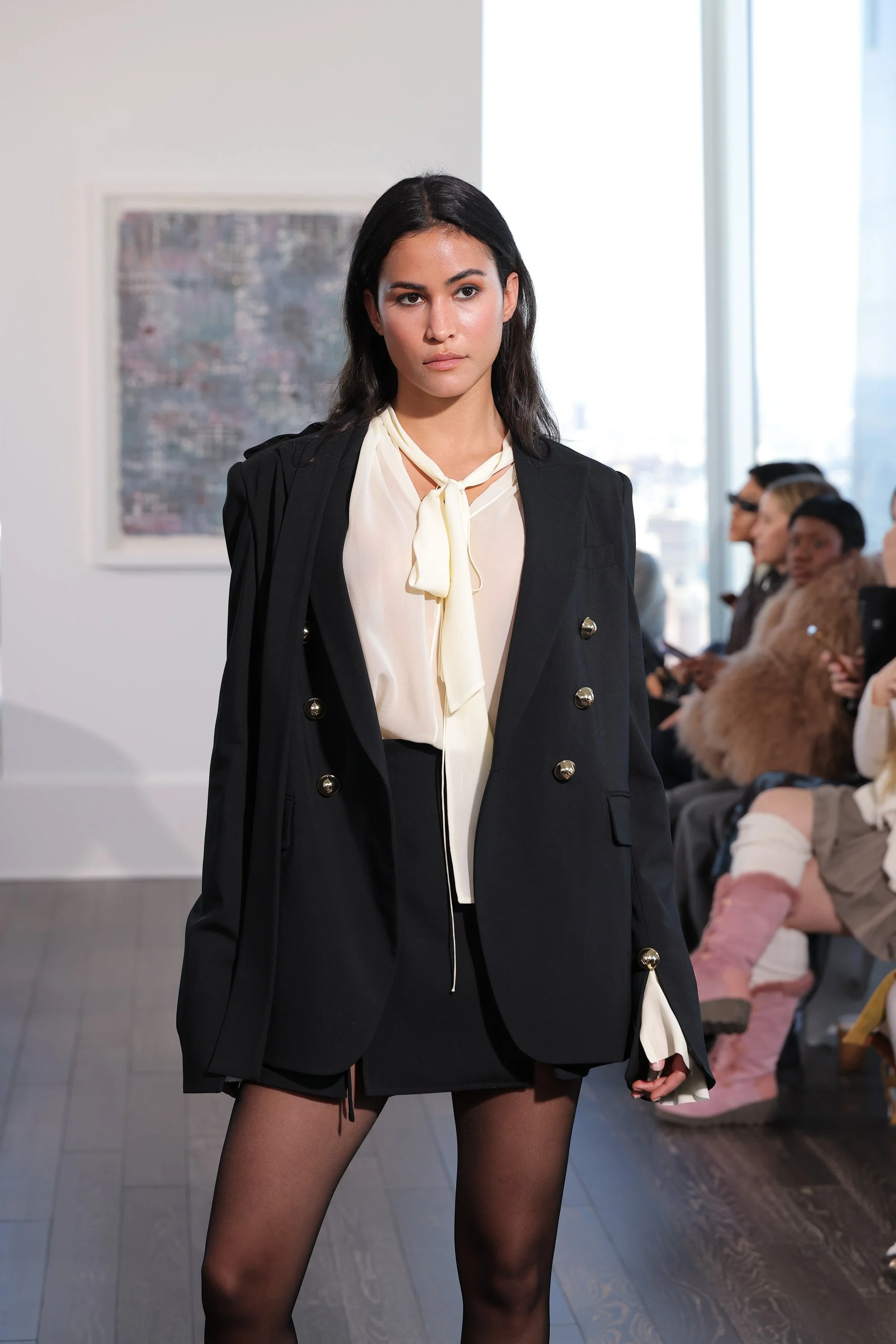
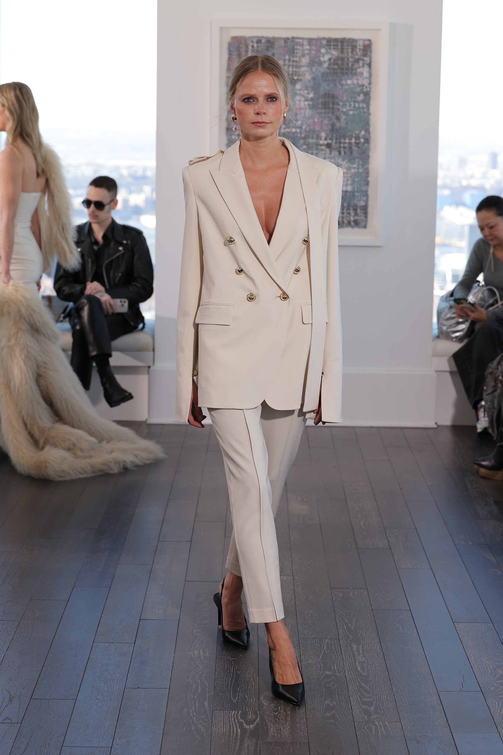
Lithuanian-American born designer Aiste Hong presented her ready to wear Fall/Winter 25 collection titled “White Nights” on February 7th. Hong has stated that her collection is “inspired by the beauty and mysticism of the European summer phenomenon when the nights never darken.” Her design choices were heavily inspired by her childhood memories and the transition from light to dark.
The collection was shown in one of many luxurious Manhattan penthouses showcasing views of NYC’s Nomad district. Hong’s collection showcased timeless pieces that were elegant with a modern touch. The main color pallets of the collection were beige, white, and black with a mix of pea green and baby blue. The collection was filled with solid colors and just a little pattern that sets the collection up to provide a bold and strong influence on women’s fashion. Although adorned with simple pieces the collection with European influence provides viewers with wanting women to feel strong and bold while wearing the collection. With draped sleeves, dramatic puffing and texture, this collection stands out. Along with these standout pieces came the simple everyday hair and makeup as well as the gold accented jewelry (provided by Ming Yung Wang New York jewelry) ; all elements provided elegance and sophistication. Aside from the fashion, the brand’s sustainability practices in partnership with Ming Yung Wang’s sustainable practices is also very commendable due to the rise of fast fashion and clothing waste.





/* =========================================================
A WORLDWIDE ARCHIVE — NASTY-INSPIRED EDITORIAL BLOG GRID
Paste into: Design → Custom CSS
========================================================= */
/* ---------- Global archive mood ---------- */
body,
#siteWrapper,
#page,
.page-section,
.collection-type-blog,
.blog-list,
.blog-basic-grid {
background: #000 !important;
color: #fff !important;
}
/* Reduce default Squarespace padding so the archive feels more like a magazine index */
.collection-type-blog #page,
.collection-type-blog .page-section,
.collection-type-blog .content-wrapper,
.collection-type-blog .sqs-layout {
max-width: none !important;
}
.collection-type-blog .content-wrapper {
padding-left: 2vw !important;
padding-right: 2vw !important;
}
/* ---------- Blog grid layout ---------- */
/* Works for most Squarespace 7.1 blog archive/list layouts */
.blog-list,
.blog-basic-grid {
display: grid !important;
grid-template-columns: repeat(3, minmax(0, 1fr)) !important;
column-gap: 18px !important;
row-gap: 70px !important;
align-items: start !important;
width: 100% !important;
}
/* Each blog post card */
.blog-item,
.blog-list-item,
.blog-basic-grid--container {
position: relative !important;
margin: 0 !important;
padding: 0 !important;
background: transparent !important;
border: none !important;
}
/* ---------- Images ---------- */
.blog-item .image-wrapper,
.blog-list-item .image-wrapper,
.blog-basic-grid--container .image-wrapper,
.blog-item .blog-image,
.blog-list-item .blog-image,
.blog-basic-grid--container .blog-image {
overflow: hidden !important;
background: #111 !important;
}
/* Make thumbnails taller and more editorial */
.blog-item img,
.blog-list-item img,
.blog-basic-grid--container img,
.blog-image img,
.image-wrapper img {
width: 100% !important;
height: 52vw !important;
max-height: 620px !important;
min-height: 420px !important;
object-fit: cover !important;
display: block !important;
filter: grayscale(8%) contrast(1.08) brightness(.92) !important;
transition: transform .7s ease, filter .7s ease, opacity .7s ease !important;
}
/* Hover movement */
.blog-item:hover img,
.blog-list-item:hover img,
.blog-basic-grid--container:hover img {
transform: scale(1.035) !important;
filter: grayscale(0%) contrast(1.16) brightness(1) !important;
}
/* ---------- Text block ---------- */
.blog-item .blog-text,
.blog-list-item .blog-text,
.blog-basic-grid--text,
.blog-meta-wrapper,
.blog-meta-section {
color: #fff !important;
}
/* Keep text tight to image */
.blog-item .blog-text,
.blog-list-item .blog-text,
.blog-basic-grid--text {
padding-top: 12px !important;
max-width: 100% !important;
}
/* ---------- Metadata: categories, date, author ---------- */
.blog-meta,
.blog-categories,
.blog-author,
.blog-date,
.blog-meta-wrapper,
.blog-meta-section,
.blog-item .blog-meta a,
.blog-list-item .blog-meta a,
.blog-basic-grid .blog-categories a {
color: rgba(255,255,255,.72) !important;
font-family: Helvetica, Arial, sans-serif !important;
font-size: 10px !important;
line-height: 1.2 !important;
letter-spacing: .08em !important;
text-transform: uppercase !important;
font-weight: 400 !important;
}
/* Category links should feel like editorial labels */
.blog-categories a,
.blog-meta a {
color: rgba(255,255,255,.72) !important;
text-decoration: none !important;
border-bottom: 1px solid rgba(255,255,255,.25) !important;
}
.blog-categories a:hover,
.blog-meta a:hover {
color: #fff !important;
border-bottom-color: #fff !important;
}
/* ---------- Titles ---------- */
.blog-title,
.blog-title a,
.blog-item-title,
.blog-list-item-title,
.blog-basic-grid .blog-title a,
.entry-title,
.entry-title a {
color: #fff !important;
font-family: Helvetica, Arial, sans-serif !important;
font-size: clamp(22px, 2.3vw, 44px) !important;
line-height: .92 !important;
letter-spacing: -.055em !important;
text-transform: none !important;
font-weight: 500 !important;
text-decoration: none !important;
margin-top: 8px !important;
margin-bottom: 8px !important;
}
/* Give titles a sharper hover */
.blog-title a:hover,
.blog-item-title a:hover,
.blog-list-item-title a:hover,
.entry-title a:hover {
opacity: .6 !important;
}
/* ---------- Excerpts ---------- */
.blog-excerpt,
.blog-excerpt p,
.blog-item .excerpt,
.blog-list-item .excerpt {
color: rgba(255,255,255,.76) !important;
font-family: Helvetica, Arial, sans-serif !important;
font-size: clamp(13px, .95vw, 16px) !important;
line-height: 1.28 !important;
letter-spacing: -.015em !important;
margin-top: 8px !important;
margin-bottom: 0 !important;
}
/* Limit excerpts so cards stay clean like an index */
.blog-excerpt {
display: -webkit-box !important;
-webkit-line-clamp: 4 !important;
-webkit-box-orient: vertical !important;
overflow: hidden !important;
}
/* ---------- Read More link ---------- */
.blog-more-link,
.blog-more-link a,
.read-more,
.read-more a,
.blog-item .sqs-block-button-element {
color: #fff !important;
background: transparent !important;
border: none !important;
padding: 0 !important;
margin-top: 14px !important;
font-family: Helvetica, Arial, sans-serif !important;
font-size: 10px !important;
line-height: 1 !important;
letter-spacing: .12em !important;
text-transform: uppercase !important;
text-decoration: none !important;
}
.blog-more-link a::after,
.read-more a::after {
content: " +" !important;
}
.blog-more-link a:hover,
.read-more a:hover {
opacity: .55 !important;
}
/* ---------- Create irregular editorial rhythm ---------- */
/* Every 1st item becomes a larger lead story */
.blog-list > *:nth-child(1),
.blog-basic-grid > *:nth-child(1) {
grid-column: span 2 !important;
}
.blog-list > *:nth-child(1) img,
.blog-basic-grid > *:nth-child(1) img {
height: 64vw !important;
max-height: 780px !important;
}
/* Every 7th item becomes wide, creating a magazine rhythm */
.blog-list > *:nth-child(7n),
.blog-basic-grid > *:nth-child(7n) {
grid-column: span 2 !important;
}
.blog-list > *:nth-child(7n) img,
.blog-basic-grid > *:nth-child(7n) img {
height: 58vw !important;
max-height: 700px !important;
}
/* ---------- Header/navigation harmony ---------- */
.header,
.site-header,
.header-announcement-bar-wrapper {
background: #000 !important;
color: #fff !important;
}
.header a,
.site-header a,
.header-nav a,
.header-menu-nav a {
color: #fff !important;
font-family: Helvetica, Arial, sans-serif !important;
font-size: 11px !important;
letter-spacing: .08em !important;
text-transform: uppercase !important;
}
/* Optional: make the active page feel like a selected magazine tab */
.header-nav-item--active a,
.header-menu-nav-item--active a {
border-bottom: 1px solid #fff !important;
}
/* ---------- Page title / archive title ---------- */
.collection-title,
.blog-list-title,
.page-title,
h1 {
color: #fff !important;
font-family: Helvetica, Arial, sans-serif !important;
font-size: clamp(42px, 8vw, 130px) !important;
line-height: .82 !important;
letter-spacing: -.075em !important;
text-transform: uppercase !important;
font-weight: 500 !important;
margin-bottom: 40px !important;
}
/* ---------- Pagination / load more ---------- */
.blog-list-pagination,
.pagination,
.item-pagination,
.blog-list .pagination {
color: #fff !important;
border-top: 1px solid rgba(255,255,255,.18) !important;
margin-top: 80px !important;
padding-top: 24px !important;
}
.pagination a,
.blog-list-pagination a,
.item-pagination a {
color: #fff !important;
font-family: Helvetica, Arial, sans-serif !important;
font-size: 11px !important;
letter-spacing: .12em !important;
text-transform: uppercase !important;
text-decoration: none !important;
}
/* ---------- Mobile ---------- */
@media screen and (max-width: 1024px) {
.blog-list,
.blog-basic-grid {
grid-template-columns: repeat(2, minmax(0, 1fr)) !important;
column-gap: 14px !important;
row-gap: 52px !important;
}
.blog-list > *:nth-child(1),
.blog-basic-grid > *:nth-child(1),
.blog-list > *:nth-child(7n),
.blog-basic-grid > *:nth-child(7n) {
grid-column: span 2 !important;
}
.blog-item img,
.blog-list-item img,
.blog-basic-grid--container img,
.blog-image img,
.image-wrapper img {
height: 70vw !important;
min-height: 340px !important;
}
}
@media screen and (max-width: 640px) {
.collection-type-blog .content-wrapper {
padding-left: 14px !important;
padding-right: 14px !important;
}
.blog-list,
.blog-basic-grid {
grid-template-columns: 1fr !important;
row-gap: 48px !important;
}
.blog-list > *,
.blog-basic-grid > * {
grid-column: span 1 !important;
}
.blog-item img,
.blog-list-item img,
.blog-basic-grid--container img,
.blog-image img,
.image-wrapper img {
height: 118vw !important;
min-height: 420px !important;
}
.blog-title,
.blog-title a,
.blog-item-title,
.blog-list-item-title,
.entry-title,
.entry-title a {
font-size: 30px !important;
line-height: .9 !important;
}
.blog-excerpt {
-webkit-line-clamp: 3 !important;
}
}